Have you ever launched a website or app only to find users struggling with usability? As a designer with years of UX/UI experience, I can tell you this: a solid mockups in UX/UI design can be the game-changer. It bridges the gap between a brilliant idea and a functional user interface. Whether you’re a solo designer, part of a team, or working with stakeholders, mockups are your visual storytelling tool.
You’ll often hear questions like “what is a mockup?” or “what is mockup design?” And those are good questions. A mockup in UX/UI isn’t just about pretty visuals—it’s where structure, usability, branding, and user expectations collide. In this post, I’ll walk you through everything you need to know—from definitions to best practices—sprinkled with lessons I’ve learned firsthand.
What is a Mockups in UX/UI Design?
Let’s start at the foundation. A mockup in UX/UI is a mid- to high-fidelity static representation of a product’s design. It’s not interactive like a prototype, but it gives a near-final look at the interface.
Define Mockup – Let’s Break It Down
- Mockup definition: A mockup is a full-color, detailed visual representation of a UI screen, showcasing layout, fonts, images, spacing, and brand styling.
- In simpler words, it’s what your users will actually see, minus the interactivity.
- Terms like mockup design meaning, mock model meaning, and mockup definition all point to the same idea: a visual design draft used before development.
What does mockup mean for designers and developers? It means alignment. Mockups help everyone on the team—from stakeholders to developers—understand the visual direction of a project without the need for code.
Why Mockups Are Essential to the UX/UI Workflow
A mockups in UX/UI design is more than just aesthetics—it supports:
- Realistic Visualization: Stakeholders can understand the design without imagining.
- Faster Feedback Loops: It’s easier to change a mockup than to change code.
- Improved Team Collaboration: Designers, developers, and product managers all get on the same page.
Over the years, I’ve seen mockups save countless hours by clarifying design direction early in the process.
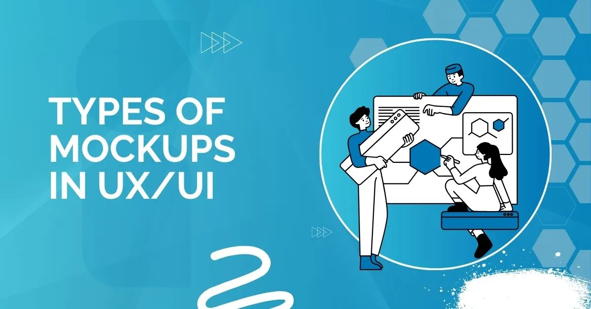
Types of Mockups in UX/UI and Their Role
Low-Fidelity vs. High-Fidelity Mockups
- Low-fidelity mockups are more about structure and layout. Think grayscale blocks.
- High-fidelity mockups in UX/UI are detailed with colors, typography, and brand assets.
Pros of Low-Fidelity:
- Easy to change
- Fast to create
Cons:
- Lacks realism
- Harder for stakeholders to interpret
Pros of High-Fidelity:
- Looks like the final product
- Easier to spot usability issues
Cons:
- Time-consuming
- Easy to get emotionally attached too early
Static vs Interactive Mockups
- Static mockups are flat images.
- Interactive mockups allow simple navigation like clicking a button or moving to another screen.
Platform-Specific Mockups
Whether it’s web, iOS, or Android, platform-specific mockups help match platform guidelines. I always recommend using UI mockups that respect platform constraints.
Core Components of a Strong Mockups in UX/UI
Let’s break down what makes a mockup user interface design effective:
1. Content Layout
What does it mean?
The way content is arranged on the screen. A well-thought-out layout helps users find what they’re looking for quickly and easily.
Why it matters:
- A clear visual hierarchy tells users what to look at first, second, and third.
- Grouping similar items (like navigation links or related products) helps users scan efficiently.
- Smart layout decisions guide the user’s eye movement naturally from top to bottom or left to right.
Example: Think of a news website. Headlines are big and bold at the top, followed by smaller subheadings and text. This is no accident—it’s hierarchy in action.
2. Color & Contrast
What does it mean?
Color isn’t just about making things pretty—it’s a powerful tool for setting the tone and improving usability.
Why it matters:
- Colors reflect brand identity (e.g., blue for trust, red for urgency).
- Contrast ensures readability, especially for users with visual impairments.
(Example: Light grey text on a white background is hard to read—bad contrast.)
Tip: Always test your color combinations with accessibility tools like contrast checkers.
3. Typography
What does it mean?
Typography refers to the fonts you choose and how you style them (size, weight, spacing).
Why it matters:
- Different fonts carry different emotions and personalities (e.g., serif fonts feel traditional; sans-serif feel modern).
- Good typography makes reading easy and pleasant.
- Using too many fonts creates confusion—stick to 2 or 3 max for consistency.
Example: A finance app might use strong, clear fonts to build trust, while a kids’ app might go with something playful and bold.
4. Spacing (White Space)
What does it mean?
White space—or negative space—is the empty area around elements.
Why it matters:
- It makes your design look clean and uncluttered.
- It gives elements room to breathe, which helps with focus and readability.
- It can even highlight important content just by giving it space.
Remember: White space is not wasted space—it’s strategic breathing room.
5. Imagery
What does it mean?
This includes photos, illustrations, icons, and other visuals.
Why it matters:
- Images support your message and make content more engaging.
- But too many visuals—or ones that don’t relate to your message—can become distractions.
- Icons should be intuitive and consistent in style (line icons, filled icons, etc.).
Tip: Use visuals to clarify, not clutter. For example, a shopping cart icon universally means checkout—no need to explain it.
Every user interface mockup I build considers these foundational principles.
Best Practices for Designing Effective Mockups in UX/UI
This is where good designers become great. If you’re aiming to make your mockups clear, functional, and team-friendly, here are some key tips I always recommend:
-
Start Mobile-First
Design for the smallest screen first. This helps you focus on the core features without unnecessary clutter. -
Use a Component Library
Pre-built components (buttons, forms, etc.) save time and keep your design consistent across screens. -
Stick to Proven Patterns
Don’t try to reinvent the wheel. Use interface patterns users already understand—they reduce confusion and improve usability. -
Make the Most of Design Tools
Tools like Figma, Adobe XD, or Sketch are more than just canvases—they help you prototype, collaborate, and streamline feedback. -
Label Files and Layers Clearly
A clean, well-organized file makes collaboration smoother, especially when working in teams or handing off to developers. -
Maintain Visual Consistency
Make sure your fonts, buttons, spacing, and layout elements look and feel aligned across all screens.
These best practices apply whether you’re working on a GUI mockup, a UX/UI design mockup, or a complete interface design project. Consistency and clarity go a long way.
Tools to Create Powerful Mockups
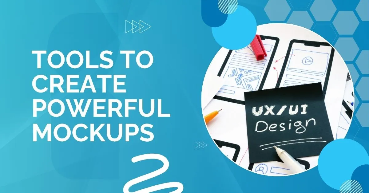
Choosing the right tool matters for mockups in UX/UI. Here are my go-to favorites:
Graphic Design Software
-
Adobe Photoshop
Great for crafting custom visuals, editing graphics, or enhancing UI elements with pixel precision. -
Adobe Illustrator
Perfect for vector-based designs—especially useful when creating scalable GUI mockups.
Mockup Design Tools
-
Figma
My daily driver. It’s cloud-based, ideal for real-time collaboration, and super intuitive for both wireframing and high-fidelity mockups. -
Sketch
Great for Mac users. Lightweight and built specifically for UI design, it’s perfect for clean and simple UI mockups. -
Adobe XD
A strong tool for building interactive user interface design mockup projects, especially when prototyping and sharing designs with teams.
Code-Based Mockups
Sometimes, advanced developers prefer to mock directly in code—great for testing responsiveness but slower for iteration.
Each of these tools supports different needs depending on where you are in your design process.
Collaborating with Developers and Stakeholders
From experience, good collaboration is what turns a mockup into a real, usable product. Don’t wait until the end—share your mockups in UX/UI early. Walk through your designs with developers and stakeholders. Explain your decisions and invite questions.
Here’s what I’ve found helps:
-
Use tools like Figma’s Inspect Panel or Zeplin—these give developers access to measurements, colors, fonts, and assets directly.
-
Leave comments inside your design files—this clears up confusion and saves time.
-
Document key interactions—let developers know what should happen on clicks, hovers, or swipes.
Clear communication during handoff means fewer misunderstandings, smoother development, and a more unified final product. Always aim for clarity and open dialogue.
FAQs About Mockups in UX/UI
What’s the difference between wireframes, mockups, and prototypes?
Wireframes = structure, Mockups = visuals, Prototypes = interaction.
Are mockups necessary for every project?
Short answer: yes. Even a basic ui ux mockup saves time.
What tool is best for beginners?
Start with Figma. It’s free and beginner-friendly.
Can mockups improve user testing?
Yes! Users understand realistic designs better.
Is there a difference between GUI and UI mockups?
They overlap. GUI mockups usually refer to desktop interfaces, while UI mockups can include mobile and web.
Final Thoughts: The Power of Mockups in UX/UI
To wrap it all up—mockups in UX/UI is your secret weapon. It brings clarity to chaos, aligns teams, and ensures users have a smooth journey. Whether you’re working on a user interface mockups project or an app prototype, investing time in good mockups pays off.
Let me leave you with this: if your design looks great in your head but you can’t explain it clearly to your team or client, it’s time for a mockup.
Have you faced mockup challenges in your own design journey? Let me know in the comments below—I’d love to share insights and learn from your experience too.
Inoma Digital: Ready to elevate your UX/UI designs? Our expert mockup services bridge ideas to stunning, user-friendly interfaces. From Figma to Photoshop, we turn visions into visual clarity. Collaborate better. Design smarter. Launch faster.
Let’s build your next big thing – visit Inoma Digital or contact us to start.